
Henderson Waves
3 posters
Page 1 of 1

Henderson Waves
![]() by Admin Sun 25 May 2008, 00:53
by Admin Sun 25 May 2008, 00:53
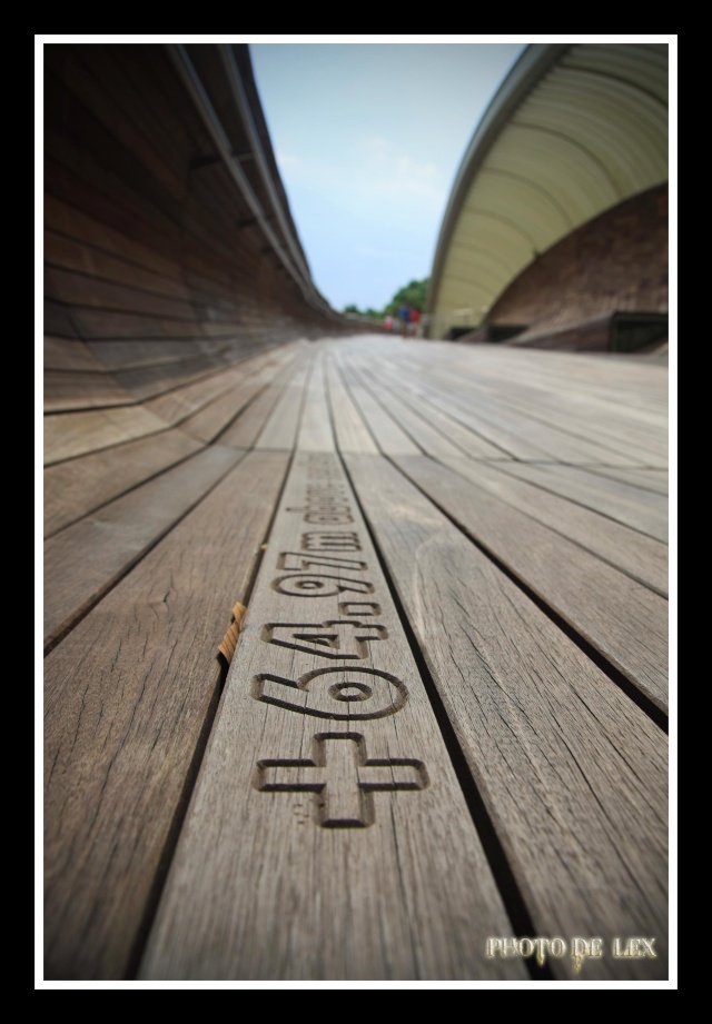
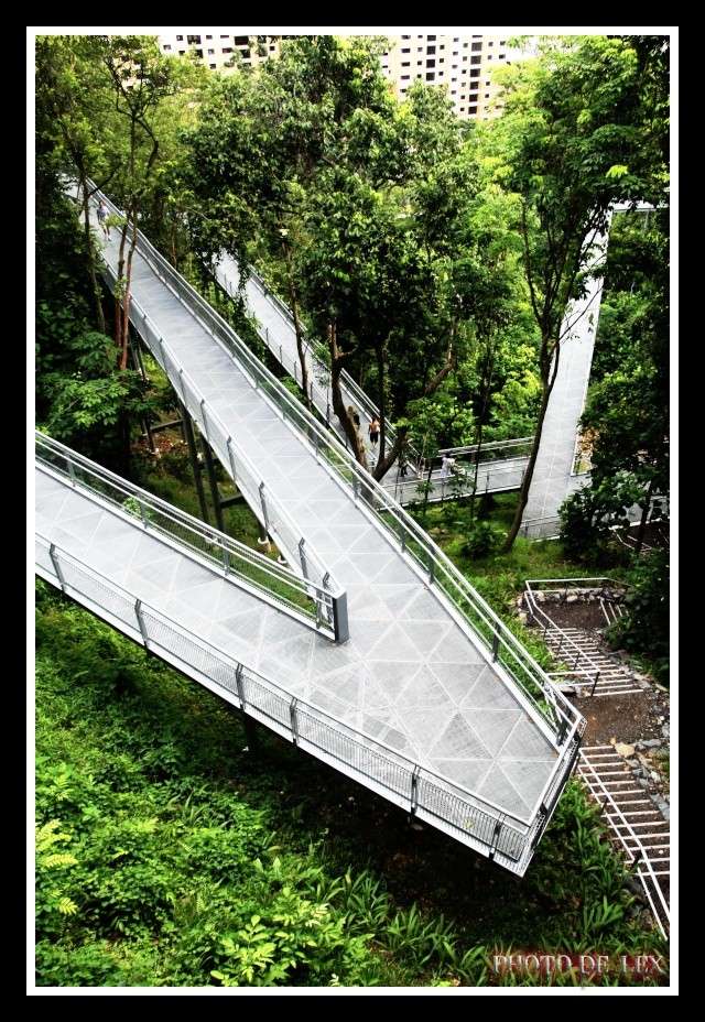
Hey peeps!! Please throw in all ur C&C for this photo~~ Thank you~ Will upload more when free..
#1
#1

Admin- Admin

-

Number of posts : 1011
Age : 41
Location : ALJUNIED
Reputation : 4
Registration date : 2008-05-04 -

Admin- Admin
-
Number of posts : 1011
Age : 41
Location : ALJUNIED
Reputation : 4
Registration date : 2008-05-04 -
Re: Henderson Waves
![]() by nicholas_khoo Sun 25 May 2008, 01:44
by nicholas_khoo Sun 25 May 2008, 01:44
hey bro,
the 1st pic is very nice! i like it!
for the 2nd pic, mm...i think it is slightly a bit too much contrast added. MAybe lessening the contrast a little will not cause the bridge pavement to be overexposed.
just my thoughts....cheers!
the 1st pic is very nice! i like it!
for the 2nd pic, mm...i think it is slightly a bit too much contrast added. MAybe lessening the contrast a little will not cause the bridge pavement to be overexposed.
just my thoughts....cheers!

nicholas_khoo- Admin
-
Number of posts : 307
Age : 45
Location : ALJUNIED
Reputation : 0
Registration date : 2008-05-04 -
Re: Henderson Waves
![]() by LAWrenceZ Mon 26 May 2008, 01:17
by LAWrenceZ Mon 26 May 2008, 01:17
well done for #1 bro, very nice, i like it as well... would prefer the "+" sign to be in focus too... =>
dont really like #2, very messy, seems like everything's meshed together.
dont really like #2, very messy, seems like everything's meshed together.

LAWrenceZ- Admin
-
Number of posts : 339
Age : 40
Location : Sengkang
Reputation : 0
Registration date : 2008-05-08 -
Page 1 of 1
Permissions in this forum:
You cannot reply to topics in this forum|
|
|